Pricing Page
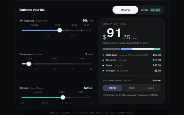
A pricing page that computes: seat slider, annual toggle and an expandable comparison matrix.
DOM + CSS1 dep1 file · 9 KB TSX
Props
// Full, shippable page — real size at normal type scale. The registry
// preview above is a scaled-down miniature of this same composition, not
// a different component.
"use client";

import { useState } from "react";
import { Check, Minus } from "lucide-react";

// ONE price per plan. A stored annual figure alongside the monthly one is how
// the two drift apart the first time somebody edits only one of them.
const PLANS = [
  { name: "Starter", monthly: 0, features: ["1 project", "Community support"] },
  { name: "Pro", monthly: 24, features: ["Unlimited projects", "Priority support", "Analytics"] },
  { name: "Enterprise", monthly: 89, features: ["SSO & SAML", "Dedicated CSM", "Custom SLA"] },
];

const MATRIX: { feature: string; tiers: Record<string, string | boolean> }[] = [
  { feature: "Projects", tiers: { Starter: "1", Pro: "Unlimited", Enterprise: "Unlimited" } },

  // ---------------------------------------------------------------
  // Full source available with a viberdy Pro subscription.
  // https://viberdy.dev/pricing
  // ---------------------------------------------------------------
}
Details
About this page template
Pricing is the one page where interactivity is not decoration: the billing toggle and the seat count ARE the decision the visitor is making, so a template that cannot compute a price is a screenshot of a pricing page rather than one. This version recalculates for real — each plan has a base and a per-seat rate, the slider drives the seat count, and the annual switch applies the discount to the computed total rather than to a hard-coded number. The card order still does the classic work: a free anchor on the left, the plan you actually want sold in the visual centre with a colored border and a Popular badge, and a heavier tier on the right that makes the middle look reasonable. The comparison table expands with a grid-template-rows transition from 0fr to 1fr, which animates to the content own height without measuring it — a max-height transition would need a guessed ceiling that either clips rows or spends most of its duration crossing empty space. Caveat: the feature matrix is illustrative, and a real launch needs a parity audit so a lower tier does not accidentally list something a higher one omits.