Sortable Data Table
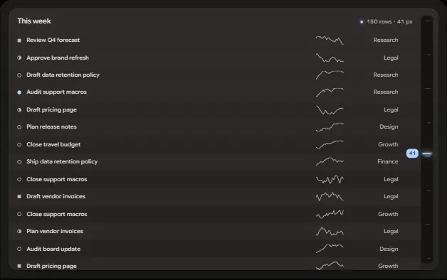
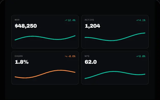
A dark data table with sticky header, three-state sort and rows that glide to their new places, highlighted search, shift-click selection with a floating bulk bar, sparklines, skeletons and phone cards.
DOM + CSS0 deps1 file · 43 KB TSXreduced-motion aware
Props
"use client";

import {
  useEffect,
  useLayoutEffect,
  useMemo,
  useRef,
  useState,
  useSyncExternalStore,
} from "react";
import type { CSSProperties, KeyboardEvent, MouseEvent, PointerEvent, ReactNode } from "react";

/* ---------------------------------------------------------------------------
 * Types
 * ------------------------------------------------------------------------- */

export type DataTableRow = {
  id: string;

  // ---------------------------------------------------------------
  // Full source available with a viberdy Pro subscription.
  // https://viberdy.dev/pricing
  // ---------------------------------------------------------------
}
Details
About this component
A client-side data table with the parts that are fiddly to get right. Column headers cycle ascending, descending, then back to the original order, with an arrow that flips on a spring and a glowing underline that sweeps in from the side the sort runs. Rows are keyed by id and re-ordered with a FLIP animation: they measure, re-render, then glide from where they were to where they are in about 260ms on a damped-spring curve; rows that appear (search, show more, first load) rise in with a short stagger. Search matches the text and status columns and marks the matched characters, with a live result count. Selection works from checkboxes, shift-click ranges and the keyboard, and a floating bar springs up with Copy CSV, Pause and Remove (with Undo). Status chips carry a soft glowing dot, revenue is right-aligned in tabular numerals with an inline sparkline per row, the first load shows a shimmering skeleton, and an empty search shows a designed empty state. pageSize pages the list with Show more / Show fewer. Below about 512px of container width, rows become stacked cards and the header becomes a row of sort pills. It takes optional rows and columns props (columns choose a kind: text, muted, status, currency, number or spark), so you can pass your own data. React only, no dependencies; it uses Tailwind v4 container-query variants (@lg:). It sorts and filters the whole array in memory, so reach for server-side paging or virtualisation beyond a few hundred rows.
Curator’s note
Rebuilt in October from a plain sortable list into a full table: the sort cycle still ends back at the original order, and the rows now move instead of jumping.