Final Call Section
The closing spread of a trade site: an oversized two-tier ask cropped by the edge, a two-field enquiry line with one filled button, and a ledger of the four things customers ring to check.
DOM + CSS0 deps1 file · 13 KB TSX
Props
"use client";

import { useState, type FormEvent } from "react";

/**
 * FinalCallSection — the last section before the footer: one ask, one form,
 * and everything a customer phones up to check.
 *
 * Every trade site ends the same way: a "Contact" heading, a five-field form
 * nobody fills in, and the phone number somewhere in the footer. This section
 * is built the way a studio would set a closing spread. The headline is the
 * image: an oversized two-tier ask (a bold statement, then an italic line
 * that says what the job could be), set flush to the left edge of the page.
 * THE POSTER ANSWERS: as soon as a name is typed the statement becomes the
 * greeting ("Tell us, Sam."), so the page addresses the person before they
 * have finished the form. Under
 * it, a two-field enquiry line: name, then phone or email, then one filled
 * button — the only accent on the page. To the right, a ledger of the four

  // ---------------------------------------------------------------
  // Full source available with a viberdy Pro subscription.
  // https://viberdy.dev/pricing
  // ---------------------------------------------------------------
}
Details
About this section
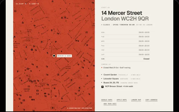
A trade site ends with a form nobody fills in and a phone number nobody can find. This section sets the ending the way a studio would set a closing spread. The headline is the image: a two-tier ask, a bold statement in oversized capitals pulled hard against the left edge, then an italic line that says what the job could be. Under it is the whole form, two fields and one button on a single hairline, because a name and a way to reach someone is all a first message needs. The button is the only filled colour on the page. To the right sits a ledger of the four things a customer phones to ask: number, email, where, when, each a real link where it can be. Monospace microcopy in the corners carries the reply promise and the live status. The form is honest about what it does: pass a handler to send the enquiry and it shows sending, sent and error states, or pass an action and it posts as plain HTML. Nothing moves until the reader acts.
Curator’s note
The contact section is where most small-business sites go to die: a five-field form and the phone number in the footer. Two fields, one button, and the four answers people ring for, set like the last spread of a catalogue.