Apple's liquid glass, introduced in 2025, isn't glassmorphism with a new name. A frosted card blurs what's behind it. Liquid glass bends it: near the edge, the backdrop curves like light through a lens. This guide rebuilds that on the web in React and Tailwind, using the free Liquid Glass Button as the working example. Move your pointer over it and press it.
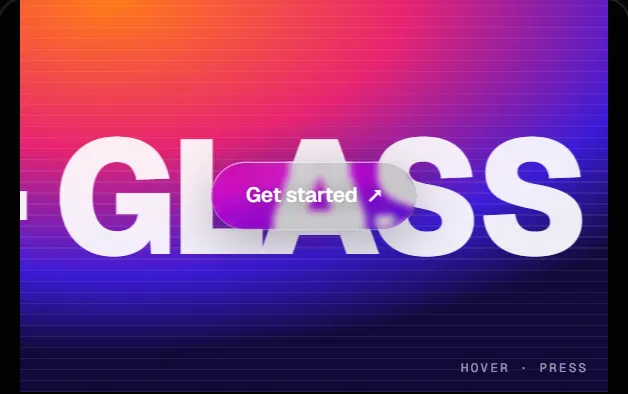
Liquid Glass Button
componentsWhy blur alone doesn't read as liquid glass
backdrop-filter: blur() softens the backdrop evenly across the whole surface, so the edge of the element is just where the blur stops. Real glass is thickest at the rim, and that's where it distorts most. So the effect needs three layers: a thin frosted base, a refraction lens at the rim, and light that tracks the pointer. Each one is a few lines.
Step 1: a frosted base that stays legible
Start with very little blur. The "clear" variant uses 3px, then saturates and brightens the backdrop so colour comes through the glass. A faint dark fill sits on top so white text stays readable over bright content.
const blur = surface === "frost" ? 14 : 3;
const base = "blur(" + blur + "px) saturate(185%) brightness(" + (tone === "dark" ? 1.08 : 1.04) + ")";
const fill = tone === "dark" ? "rgba(10,10,18,0.22)" : "rgba(255,255,255,0.34)";

const style = {
  background: fill,
  backdropFilter: base,
  WebkitBackdropFilter: base,
  boxShadow:
    "inset 0 1px 0 rgba(255,255,255,0.55), inset 0 -1px 0 rgba(255,255,255,0.18), 0 12px 40px rgba(0,0,0,0.28)",
};Step 2: refraction with an SVG displacement map
The lens is an SVG feDisplacementMap. It shifts each pixel of its input by an amount read from a map image: the red channel moves pixels on x, green moves them on y, and 128 means no movement. Put the filter inside backdrop-filter and the input is the backdrop itself.
<svg aria-hidden width="0" height="0" style={{ position: "absolute" }}>
  <filter id={filterId} x="0" y="0" width="100%" height="100%" colorInterpolationFilters="sRGB">
    <feImage ref={mapRef} x="0" y="0" preserveAspectRatio="none" result="map" />
    <feDisplacementMap ref={dispRef} in="SourceGraphic" in2="map" scale="28"
      xChannelSelector="R" yChannelSelector="G" />
  </filter>
</svg>
The map is drawn on a canvas at the element's exact pixel size. For each pixel, take the signed distance to a rounded rectangle. Inside a narrow bezel near the rim, push the pixel inward along the edge's normal, harder the closer it is to the edge. The backdrop at the rim then comes from further in, which is the magnified, bent edge of a lens.
const t = -sd(x, y); // distance inside the edge
if (t > 0 && t < bezel) {
  const nx = sd(x + 0.5, y) - sd(x - 0.5, y);
  const ny = sd(x, y + 0.5) - sd(x, y - 0.5);
  const len = Math.hypot(nx, ny) || 1;
  const m = Math.pow(1 - t / bezel, 2); // strongest at the rim
  dx = (-nx / len) * m;
  dy = (-ny / len) * m;
}
img.data[k] = Math.round(128 + 127 * dx);     // red: x offset
img.data[k + 1] = Math.round(128 + 127 * dy); // green: y offsetKeep the bezel narrow: on a 56px pill the button uses min(h × 0.24, 12px). A wide bezel bends the whole surface, and the middle stops looking like clear glass.
const chromium = !!ua?.brands?.some((b) => /Chromium/.test(b.brand));
el.style.backdropFilter = chromium && refraction > 0
  ? "url(#" + filterId + ") " + base
  : base;
Step 3: a rim and a highlight lit by the pointer
Glass looks wet because of its highlights. The pointer position is written straight to CSS variables on the element, without React state, so moving the pointer never re-renders the component. Two layers read those variables: a 1px rim brightest nearest the pointer, and a soft sheen that follows it.
function onPointerMove(e: React.PointerEvent<HTMLElement>) {
  const el = e.currentTarget;
  const r = el.getBoundingClientRect();
  el.style.setProperty("--lgx", ((e.clientX - r.left) / r.width) * 100 + "%");
  el.style.setProperty("--lgy", ((e.clientY - r.top) / r.height) * 100 + "%");
  el.style.setProperty("--lgo", "1");
}

// The rim: a padded span masked down to its 1px border.
<span aria-hidden className="pointer-events-none absolute inset-0 rounded-full" style={{
  padding: 1,
  background: "radial-gradient(120px circle at var(--lgx) var(--lgy), rgba(255,255,255,calc(0.25 + var(--lgo) * 0.6)), rgba(255,255,255,0.14) 70%)",
  mask: "linear-gradient(#000 0 0) content-box exclude, linear-gradient(#000 0 0)",
}} />Step 4: a press that squashes like gel
On press the button scales a little more on y than on x (0.98 by 0.97) over 100ms. On release it springs back over 300ms with an overshooting curve, cubic-bezier(0.34, 1.4, 0.64, 1). A radial glow starts under the finger and spreads while it's held. All of this is Tailwind active: and group-active: classes, with no JavaScript animation.
Another approach: magnify a copy instead of the backdrop
The Liquid Glass Switch takes a different route. While you hold the knob, it swells over an aligned copy of the track, so the track reads as magnified through clear glass. The lens filter is a regular CSS filter: url(#lens) on that copy, not a backdrop filter. It's useful when the thing behind the glass is your own UI rather than a page backdrop.
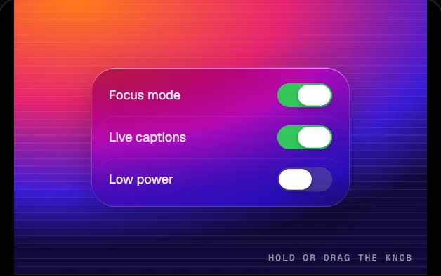
Liquid Glass Switch
componentsAccessibility and performance checklist
- A visible focus ring (
focus-visible:ring-2): glass edges are too faint to show focus on their own. - A dimming fill under light text: glass over a bright photo otherwise fails contrast.
- Rebuild the displacement map only on resize. It's a full canvas pass, so never run it per frame.
- Respect
prefers-reduced-motionfor the swelling and squash effects. The switch drops its lens scale under it. - Glass needs something rich behind it. Over a flat colour it's a grey pill, which is how glass behaves, not a bug in the component.
Install it
Both components are free, with full TSX source and an AI prompt you can paste into Claude, Cursor or v0 to adapt them. Each installs into a shadcn/ui project with one command, shown under its preview above. The Liquid Glass Button and Liquid Glass Switch pages have the props panel and full source.
Building a whole interface in this material? The Glassmorphism style collects every glass entry. The Pro Liquid Glass Tab Bar, whose selection is a droplet that stretches as it travels, and the Glass Refraction Panel card use the same lens. See what Pro includes.